- Free Estimates

✔ High-contrast exterior colors create stronger curb appeal and visual depth
✔ Clean lines and proper execution are critical for a polished look
✔ Popular combinations include black and white, navy and white, and charcoal with wood accents
✔ Exterior paint in Connecticut typically lasts 5 to 10 years with proper preparation
✔ Working with experienced painting contractors ensures durability and precise results
Beige and soft neutrals once dominated residential exteriors for a reason.
They felt safe, widely acceptable, and easy to maintain. Today’s homeowners are making more intentional design choices, especially when it comes to curb appeal. High-contrast exterior color schemes are gaining traction because they create sharper visual definition, highlight architectural details, and give homes a more updated, custom look.
A well-executed contrast does more than add color. It brings structure, balance, and character to a home’s exterior. The difference between a flat facade and a striking one often comes down to how colors interact. This is where experienced painting contractors play a critical role, ensuring that contrast is applied with precision, durability, and long-term appeal.
A high-contrast exterior color scheme uses distinctly different tones to create visual separation between key elements of a home. Instead of blending siding, trim, and accents into a uniform palette, contrast emphasizes each component.
Low-contrast designs typically rely on subtle shifts in shade. High-contrast schemes, on the other hand, pair light and dark tones or neutral bases with bold accents. Common examples include white siding with black trim, deep navy paired with crisp white, or soft gray contrasted with charcoal details.
This approach works because it adds depth. Trim lines appear sharper, windows feel more defined, and the overall structure becomes easier to visually read from a distance. When applied correctly, contrast elevates both traditional and modern homes without overwhelming the design.
Homes with high-contrast exteriors naturally draw the eye. The clear distinction between colors creates a sense of intention and care, which stands out in neighborhoods filled with similar layouts. Even subtle contrast can make a home appear more refined and memorable.
Features like crown molding, shutters, columns, and window casings often get lost in monochromatic designs. Contrast brings those elements forward. For homes with classic New England architecture, this can dramatically enhance historical character while still feeling updated.
Exterior updates are one of the most visible improvements a homeowner can make. A thoughtfully chosen color scheme signals maintenance and attention to detail. According to the National Association of Realtors, curb appeal plays a major role in attracting buyers, with 92% of agents recommending exterior improvements before listing a home.
High contrast is not limited to modern homes. Colonial, Cape Cod, and Craftsman styles all benefit from well-balanced palettes. The key is adjusting the intensity. A softer contrast can maintain tradition, while a bold combination leans more contemporary.
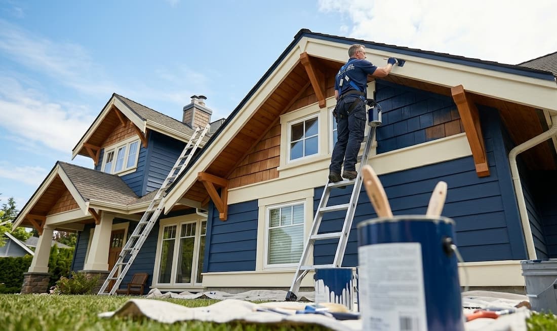
Few combinations feel as sharp and enduring as white siding paired with black trim. This look defines edges clearly and works especially well for farmhouse and Colonial homes. It offers contrast without complexity.
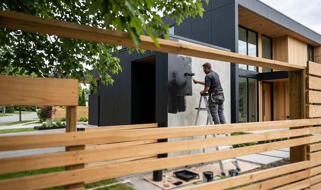
Dark gray exteriors paired with natural wood accents create a grounded, sophisticated look. The warmth of wood softens the boldness of charcoal, making it a balanced option for homeowners who want contrast without harshness.
Navy provides depth without feeling too heavy. Paired with white trim, it delivers a polished appearance that works well across different architectural styles, especially in regions with coastal or historic influences.
A light gray base with darker blue or black accents introduces contrast in a more understated way. This is often a comfortable transition for homeowners moving away from beige but not ready for dramatic changes.
Taupe or beige siding combined with deep green, burgundy, or navy doors and shutters keeps the base familiar while adding personality. This approach allows contrast to exist without redefining the entire exterior.
Start by identifying the elements that can benefit from contrast. Trim, fascia boards, shutters, and entryways are ideal areas to introduce darker or lighter tones.
Roof color, brickwork, stone features, and even landscaping play a role in how paint colors appear. A strong palette complements these existing features rather than competing with them.
This classic design guideline helps maintain balance. Use a dominant color for siding, a secondary tone for trim, and a smaller accent color for doors or shutters. This prevents the design from feeling chaotic.
Exterior lighting changes throughout the day. Testing samples on different sides of the home helps avoid surprises once the full application is complete.
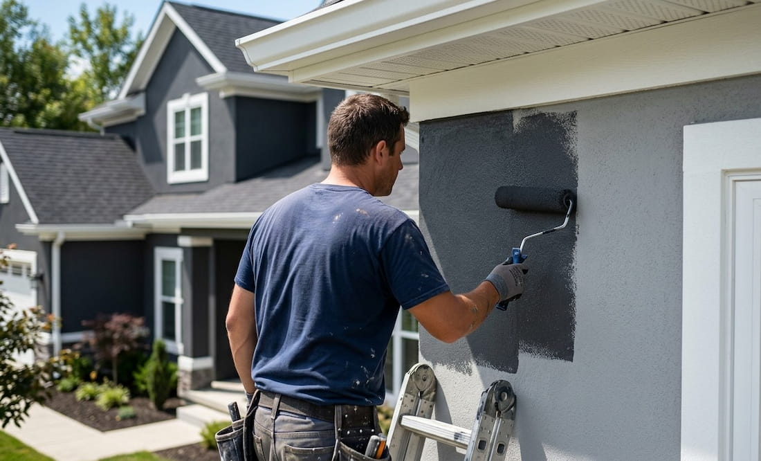
Execution matters just as much as color choice. Clean lines, proper surface preparation, and high-quality materials ensure that contrast looks intentional and lasts through seasonal changes.
While high-contrast color schemes possess the power to significantly elevate curb appeal, execution is everything. Small missteps during the selection or application process can quickly undermine the final result. By avoiding these common pitfalls, homeowners can ensure their new design feels intentional, balanced, and built to withstand the elements.
Contrast is most effective when it maintains visual clarity. Introducing too many bold competing tones can overwhelm the home’s architecture, causing the design to feel chaotic rather than sophisticated.
A striking exterior should stand out for the right reasons. It is vital to consider how your palette interacts with nearby properties and adheres to local HOA guidelines to ensure the home remains a cohesive part of the community.
Ultra-modern color trends can date a home quickly. To protect your investment, prioritize combinations that offer a balance of immediate visual impact and long-term aesthetic appeal.
Even the most beautiful high-contrast colors will fail without thorough cleaning, priming, and repairs. Professional painting contractors ensure the sharp lines and durable finishes necessary for a truly polished look.
Achieving a high-contrast exterior requires more than just a bold eye for color; it demands technical precision. In Southbury, the effectiveness of a sharp palette relies on the flawless execution of clean lines where siding meets trim. Because contrast naturally draws the eye to edges, even the slightest inconsistency can disrupt the visual flow, making professional application a necessity for a polished result.
Southbury’s residential landscape is a distinct blend of classic Colonial, Cape Cod, and contemporary builds. Whether dealing with traditional wood clapboard or modern composite siding, each material interacts differently with light and pigments. Local painting contractors understand these nuances, helping homeowners select high-contrast combinations that honor the home’s structural integrity while remaining sensitive to neighborhood aesthetics.
The New England climate presents unique challenges for exterior finishes. Between humid summers and freezing winters, Southbury homes endure significant thermal expansion and contraction. Skilled professionals mitigate these environmental stressors by utilizing premium, weather-resistant products and adhering to rigorous preparation standards—including thorough scraping, sanding, and priming—to ensure the finish remains vibrant and intact.
While high-contrast schemes provide a modern edge, they must still harmonize with Southbury’s traditional character. The goal is to create a striking visual impact that feels intentional rather than out of place. Experienced contractors provide the necessary perspective to balance bold personal style with the established visual rhythm of the community.
Partnering with seasoned painting experts in Southbury is an investment in both beauty and longevity. A professional approach ensures that your high-contrast design is not only visually sharp upon completion but remains a durable, high-performing asset that withstands the seasons for years to come.
Neutral bases paired with strong contrast accents tend to appeal to a wide range of buyers and enhance perceived value.
Yes. When aligned with the home’s architecture, contrast can highlight original features and add depth without compromising character.
Most high-quality exterior paint jobs last between 5 to 10 years, depending on surface preparation and environmental exposure.
Absolutely. Deep blues, greens, and charcoals provide contrast while offering a softer alternative to black.
Many professionals provide guidance based on experience, helping homeowners choose colors that balance style, durability, and resale appeal.
High-contrast exterior color schemes bring clarity, structure, and modern appeal to any home when done right. The difference lies in thoughtful color selection and precise execution. For homeowners ready to move beyond outdated palettes, working with experienced professionals ensures the result feels intentional and built to last. Southbury House Painting Experts delivers the level of craftsmanship needed to achieve clean lines, balanced contrast, and durable finishes that elevate curb appeal.
Take the next step toward a more striking exterior.
Refresh your exterior.