- Free Estimates

✔ Cloud Dancer is a warm off-white that replaces harsh, sterile whites
✔ Patina Blue adds subtle color without overwhelming a space
✔ Silhouette provides depth and contrast without reading as black
✔ These colors work best when used together with intention
✔ Proper prep and application matter as much as color choice
Color trends don’t exist to dictate design choices—they reflect how people want their homes to feel. The 2026 Colors of the Year point clearly in one direction: calm, grounded, and intentional. Instead of bold statements meant to impress, this year’s palette emphasizes livability, balance, and longevity.
Three shades are leading that shift: Cloud Dancer, Patina Blue, and Silhouette. Each serves a different purpose, but all work toward the same goal—creating spaces that feel considered, comfortable, and timeless.
For homeowners planning an interior or exterior paint update, understanding how to use these colors correctly is key to getting results that last beyond a trend cycle.
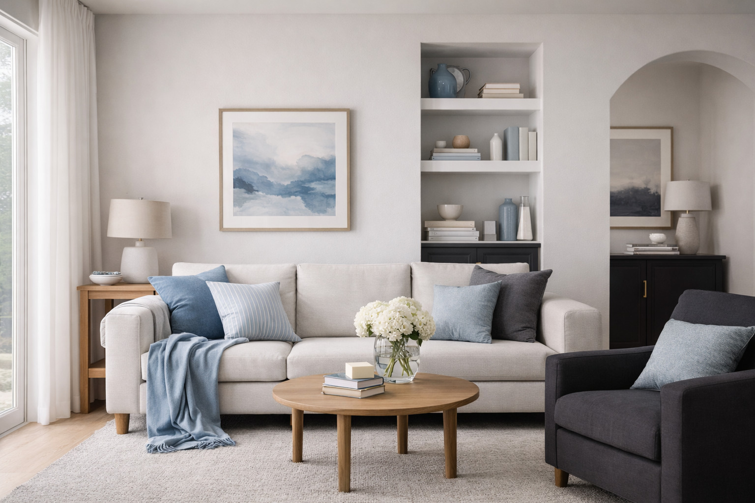
Cloud Dancer is a soft, warm off-white with subtle depth. It avoids the clinical feel of pure white while remaining bright enough to open up a space. This makes it one of the most versatile colors of the year.
Cloud Dancer excels in areas where light and flow matter most:
Because it has gentle undertones, Cloud Dancer adapts well to both warm and cool lighting, reducing the risk of unexpected color shifts throughout the day.
Cloud Dancer is particularly effective for resale-minded homeowners because it appeals broadly while still feeling current.
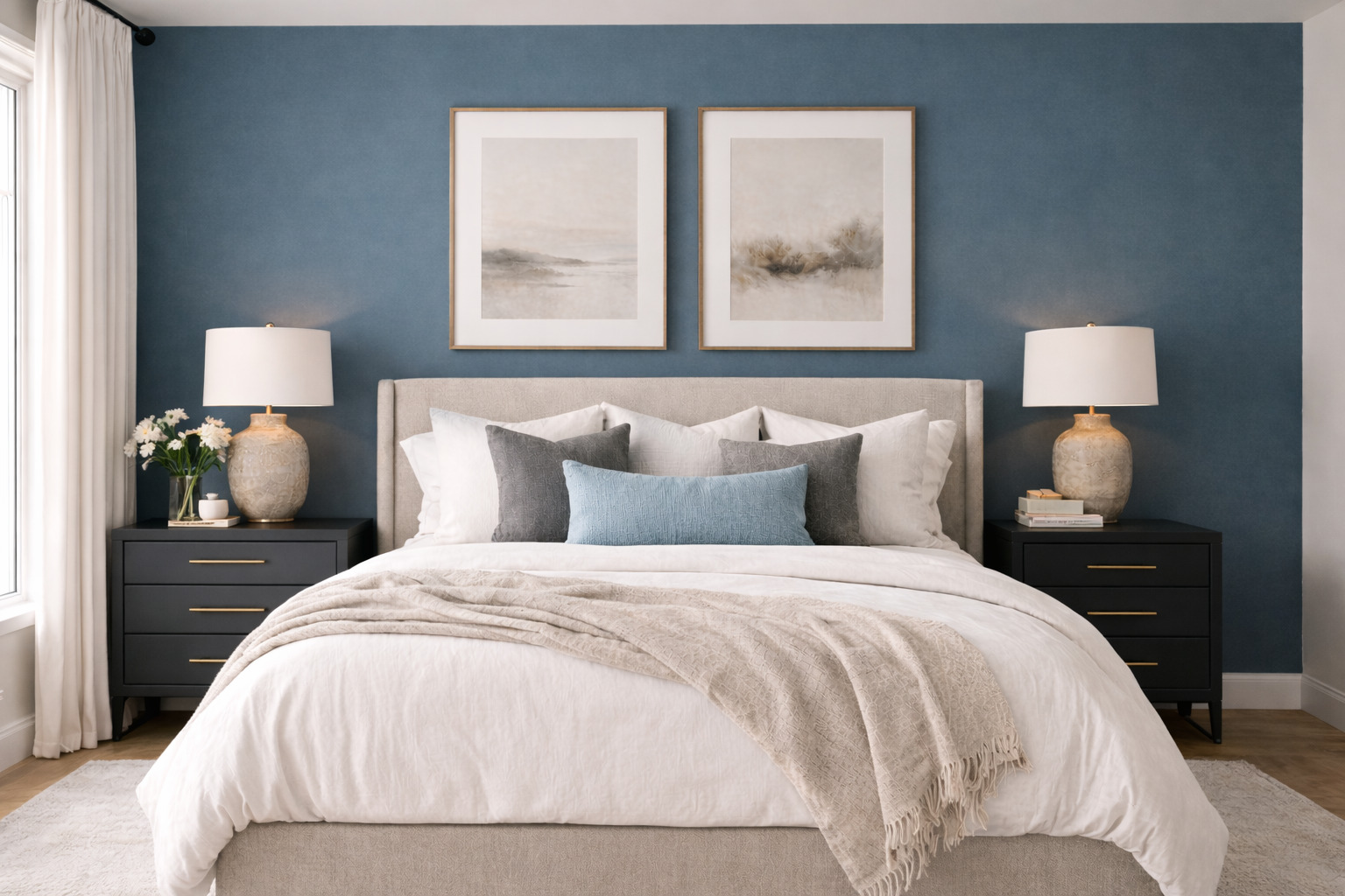
Patina Blue sits between blue and green, inspired by aged metal and natural weathering. It’s calm but not passive, making it a strong choice for homeowners who want color without visual noise.
Unlike brighter blues that date quickly, Patina Blue has muted saturation. This gives it staying power and makes it easier to integrate with existing finishes like wood floors, stone, or brushed metals.
Patina Blue works especially well with:
Used thoughtfully, Patina Blue adds personality while maintaining balance.
Silhouette is a dark, charcoal-based neutral with subtle warmth. It’s not black, and it’s not gray—it sits comfortably between the two. This makes it ideal for homeowners looking to add depth without dramatic contrast.
Dark colors work best when they serve a purpose. Silhouette is effective in:
Rather than dominating a room, Silhouette anchors it.
When applied strategically, Silhouette adds sophistication rather than heaviness.
One of the strengths of this year’s palette is how well the colors work together. Each serves a distinct role, making it easier to design cohesive interiors.
This combination creates visual interest without overwhelming the home. It also allows flexibility—individual rooms can evolve without clashing with the rest of the house.
Color behaves differently indoors and outdoors. Light exposure, surrounding materials, and scale all affect how paint appears.
Testing samples in real conditions is essential before committing, especially outdoors.
Even the right colors can fall flat if applied incorrectly. The most common issues include:
Professional guidance helps avoid these problems and ensures the finished result aligns with the homeowner’s goals.
Paint color gets the attention, but application determines the outcome. Proper surface preparation, clean lines, and even coverage are what make a color look intentional rather than rushed.
Experienced painters understand how different finishes, lighting, and surfaces affect the final appearance. This is especially important with nuanced colors like those defining 2026.
The 2026 Colors of the Year aren’t about loud statements—they’re about spaces that feel calm, grounded, and finished. Cloud Dancer keeps rooms bright without feeling sterile. Patina Blue adds muted color that plays well with wood, stone, and warm metals. Silhouette brings depth and contrast when you want a room to feel more intentional.
If you’re planning a repaint and want these colors to look right in your lighting—and hold up over time—execution matters as much as selection. Surface prep, sheen choice, and clean edges are what separate a “new color” from a true upgrade.
If you’re in the Southbury area and want an experienced team to handle the details, Southbury House Painting Experts can help you translate these 2026 shades into a durable, polished result that fits your home.
The 2026 Colors of the Year—Cloud Dancer, Patina Blue, and Silhouette—focus on warmth, calm, and balance. These shades emphasize livability and long-term appeal rather than bold, short-lived trends.
Cloud Dancer is often preferred over pure white because it has warmer undertones. It reflects light well without appearing stark or cold, making it easier to use across multiple rooms.
Patina Blue works best in bedrooms, bathrooms, home offices, or as an accent wall. Its muted tone adds color while maintaining a relaxed, timeless feel.
Yes—when used strategically. Silhouette works well on accent walls, cabinetry, or trim. Pairing it with lighter walls and proper lighting prevents rooms from feeling closed in.
Neutral-forward trends like the 2026 palette can support resale value when applied professionally. Colors that feel calm and balanced tend to appeal to a wider range of buyers.